AW Conqueror


 1
1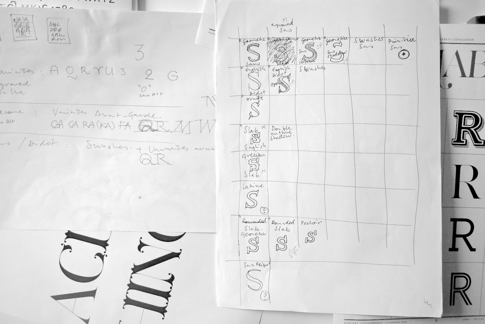 2
2 3
3 4
4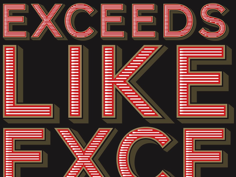 5
5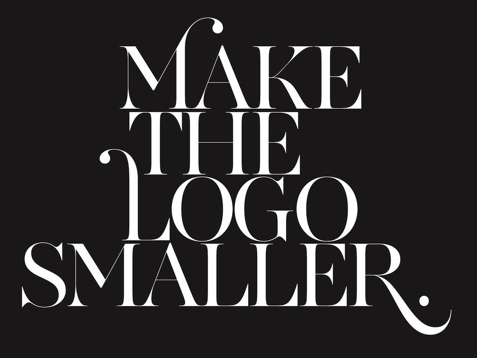 6
6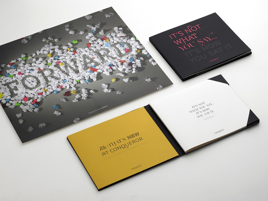 7
7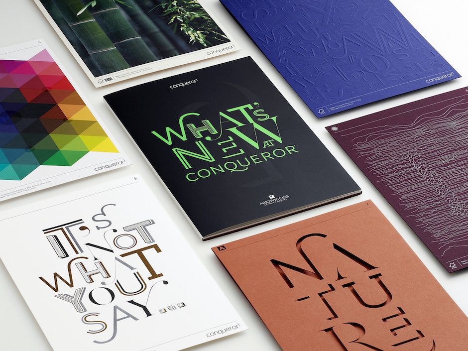 8
8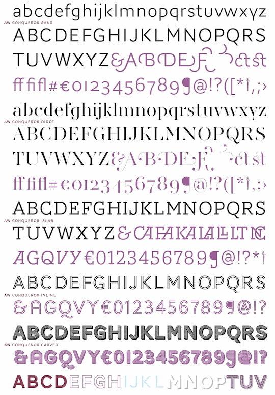 9
9AW Conqueror for Arjowiggins
We’ve have been approached at the end of 2009 by Reflex Image to create a set of typefaces to relaunch the Conqueror papers collection. An important website and various others communications material was created by the agency.
This family include 5 variations with great potential: Small glyph sets, mostly all caps, but based on same structure, with some connection between them (width for example), to offer a great & easy titling toolbox to any designers, from skillful to beginner. We should recall that a paper collection is generally based on similar roots, with various “flavors,” colors. A collection of typefaces should reflect this similar mood, even the style of papers should be reflected into the fonts. The typefaces style built all together the brand. Each of the members try their best to be different from the others because of their features. They should work harmoniously in contrast.
AW Conqueror, five different styles family
The AW Conqueror Sans typeface draws inspiration from those in vogue in Europe between World Wars I and II. With its geometric lines it evokes the spirits of both Bauhaus and the Art Déco period. AW Conqueror Sans, a contemporary Sanserif, is the cornerstone of the family and the jumping off point for the rest of the typefaces. Any text may be swapped around without changing the layout. More commonly seen in Renaissance italics, swashes capitals have also been added.
The AW Conqueror Didot typeface is not inspired by the Didot dynasty of the early 19th century but rather the spectacular interpretations of them appearing in the 1960s and 70s. Decades in which large type sizes were all the rage in advertising and publishing, contrasted typefaces were everywhere. This new font is an ode to the heyday of dry-transfer alphabets and Herb Lubalin, the typographer who mastered the ‘tight but not touching’ art of glyphs set ascloseasthis without overlapping.
Several titling typefaces made their appearance at the start of the 20th century, notably Acier and Bifur, both created by French poster artist Cassandre.Later, in the Netherlands, S.H. de Roos designed a version of Inline for its Nobel family called, naturally, Nobel Inline. AW Conqueror Inline pays homage to this beautiful version.
A version of AW Conqueror Sans, AW Conqueror Slab draws inspiration from geometrical slab serifs of the 1930s, of which Rockwell is a perfect example. Lubalin Graph, a reworking of the genre, came out in the wake of the Avant Garde wave of the early 70s. In recent years, ‘slabs’ have made a comeback in the graphic design world. AW Conqueror Slab advances the cause quite happily.
This typeface* encapsulates perfectly the lettering styles in fashion during the 19th century quite often in the frontispieces of books. It wasn’t rare to see these kinds of typefaces, with their variations in depth and relief effects, adorning boxes and other forms of packaging of the time.
— More details about the design and samples
— Download at Typofonderie.com
Creative Director: Nicolas Champion.
Client: Reflex & Arjowiggins.
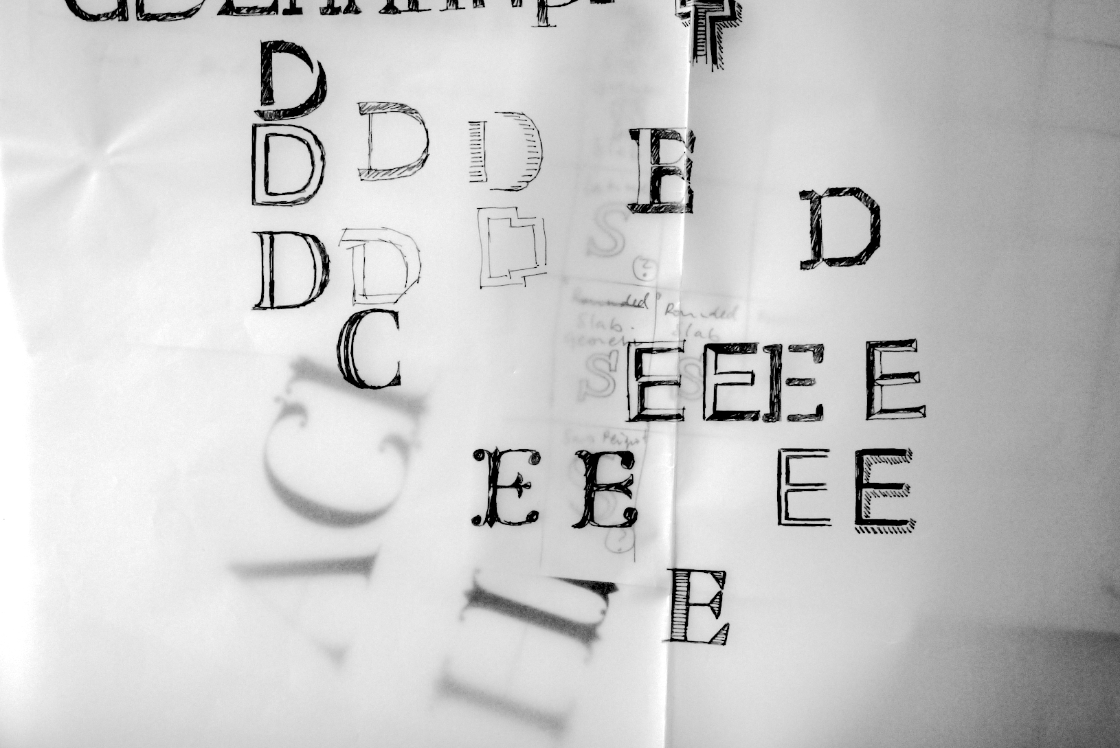
1. to 2. AW Conqueror typeface: early sketches.
3. to 6. AW Conqueror typeface fake in use we’ve made for the pitch.
7. to 8. AW Conqueror typeface materials designed by Reflex. The designer Seb Lester and the photographer Thomas Brown have been hired to create various visuals using Conqueror fonts.
9. AW Conqueror typeface specimen.
Awards
— Club des directeurs artistiques: 42e Palmarès Prix 2010, Typography category, typeface design. Custom typeface family AW Conqueror for Arjowiggins via ReflexImage, 04-2011. The brochure dedicated to AW Conqueror created by Frédéric Teyssiere at Reflex Image won also a prize during this Palmarès.
— Ed-Awards: Silver Award winner in category “25. Original Typeface” of the European Design Awards 2011. 05-2011. The brochure dedicated to AW Conqueror created by Frédéric Teyssiere at Reflex Image won also a prize during this competition.
Copyright
The AW Conqueror fonts are available at the Typofonderie website for free.