Mencken


 1
1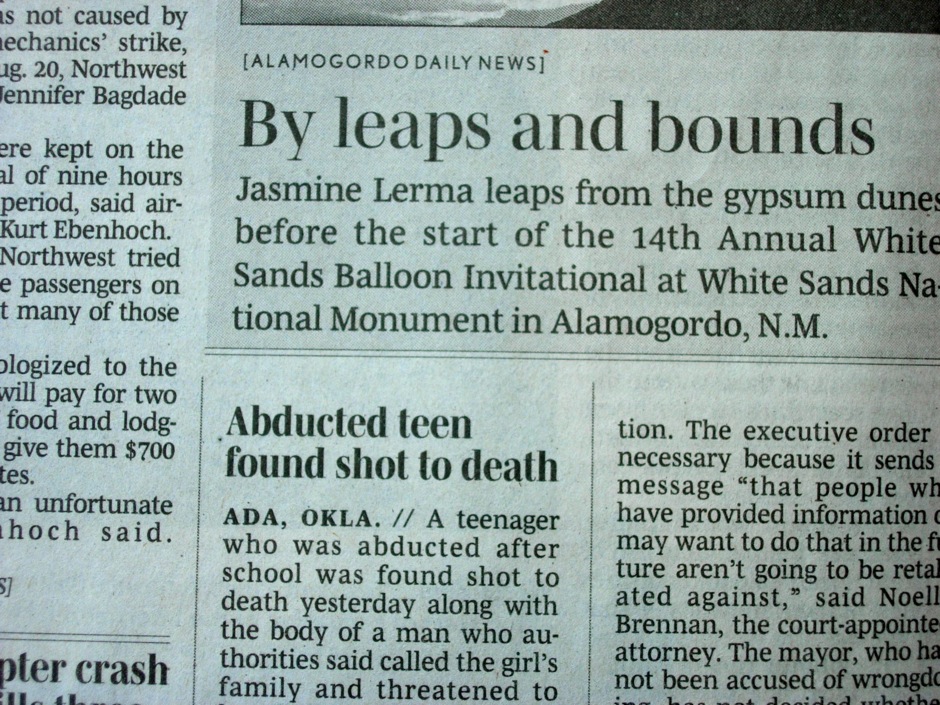 2
2 3
3 4
4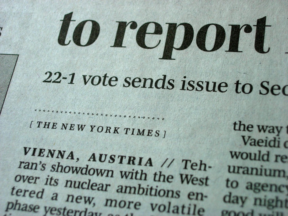 5
5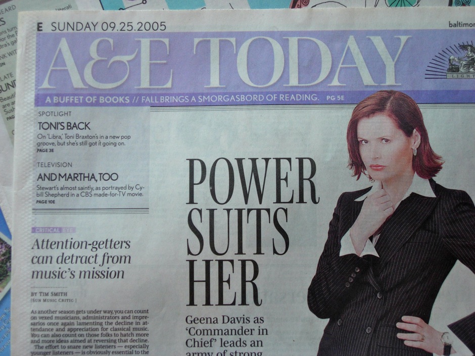 6
6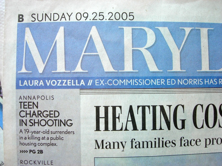 7
7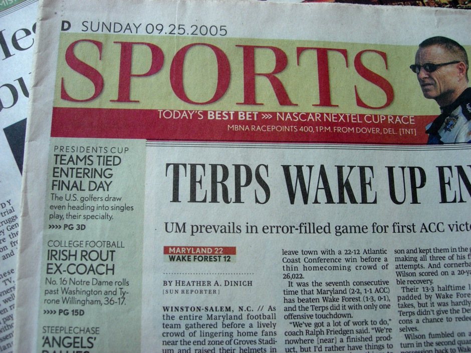 8
8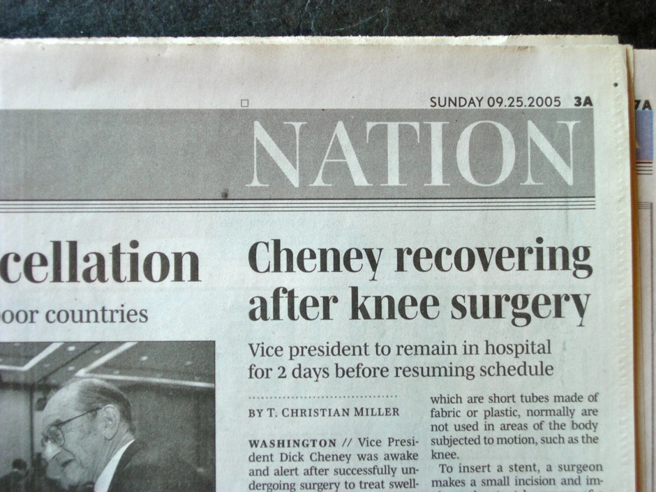 9
9Mencken
The Mencken family was created for The Baltimore Sun. The first objective was to replace the previous custom fonts designed in the middle of the nineties which, according the reader survey conducted by The Sun,was one of the first points of dissatisfaction. Focus groups conducted during the redesign period liked the Mencken family; tests with online reader panels showed 75 percent preferred Mencken over the previous Sun typefaces. After the redesign launch, The Sun has received lots of feedback. Some reader response was particularly enjoyable: “It’s easier to read with the new type even though the type is designed by the French.”
The Mencken family include various members, each of them specially designed for their own function. See the dedicated page created by The Sun at the launch of the redesign.
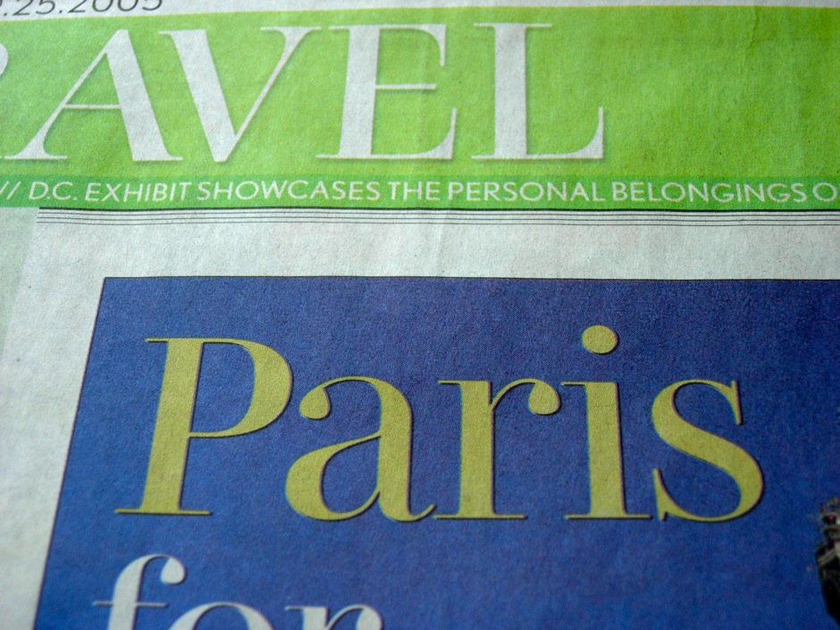
Mencken Text (in addition the subhead) is a low contrast Transitional-style typeface designed with an oblique axis, an emphasis on horizontals and possesses open counters. The Text family features more Didonesque capitals to harmonise with the Head versions.
Mencken Head (and various narrow widths) is a high contrast typeface designed in the style of the Didot(typical french typeface from the end of 18th century) not so common in North America today. The objective was to make more legible and simple headlines with a unique flavour.
A multi-format typeface family, Mencken appears in OpenType format, as well as Type 1 PostScript and TrueType (Type 1 and TrueType formats contain a special encoding for fractions as well as several additional fonts for small caps and all caps).
The family’s name Mencken is a tribute to H.L. Mencken’s journalistic contributions to The Sun. According to the London Daily Mail, Mencken ventured beyond the typewriter into the world of typography. Because he felt Americans did not recognize irony when they read it, he proposed the creation of a special typeface to be called ironics, with the text slanting in the opposite direction from italic types, to indicate the author’s humour.
Consultant: Lucie Lacava.
Client: The Baltimore Sun.
Awards
Mencken won a Creative Review Type Awards in January 2006.
Availability and licences
Mencken is a typeface family who was in exclusivity for The Baltimore Sun until September 2008. Now can be used for any kind of projects under certain conditions. Please contact Typofonderie directly for your specific requests and licences questions.