Larousse dictionaries


 1
1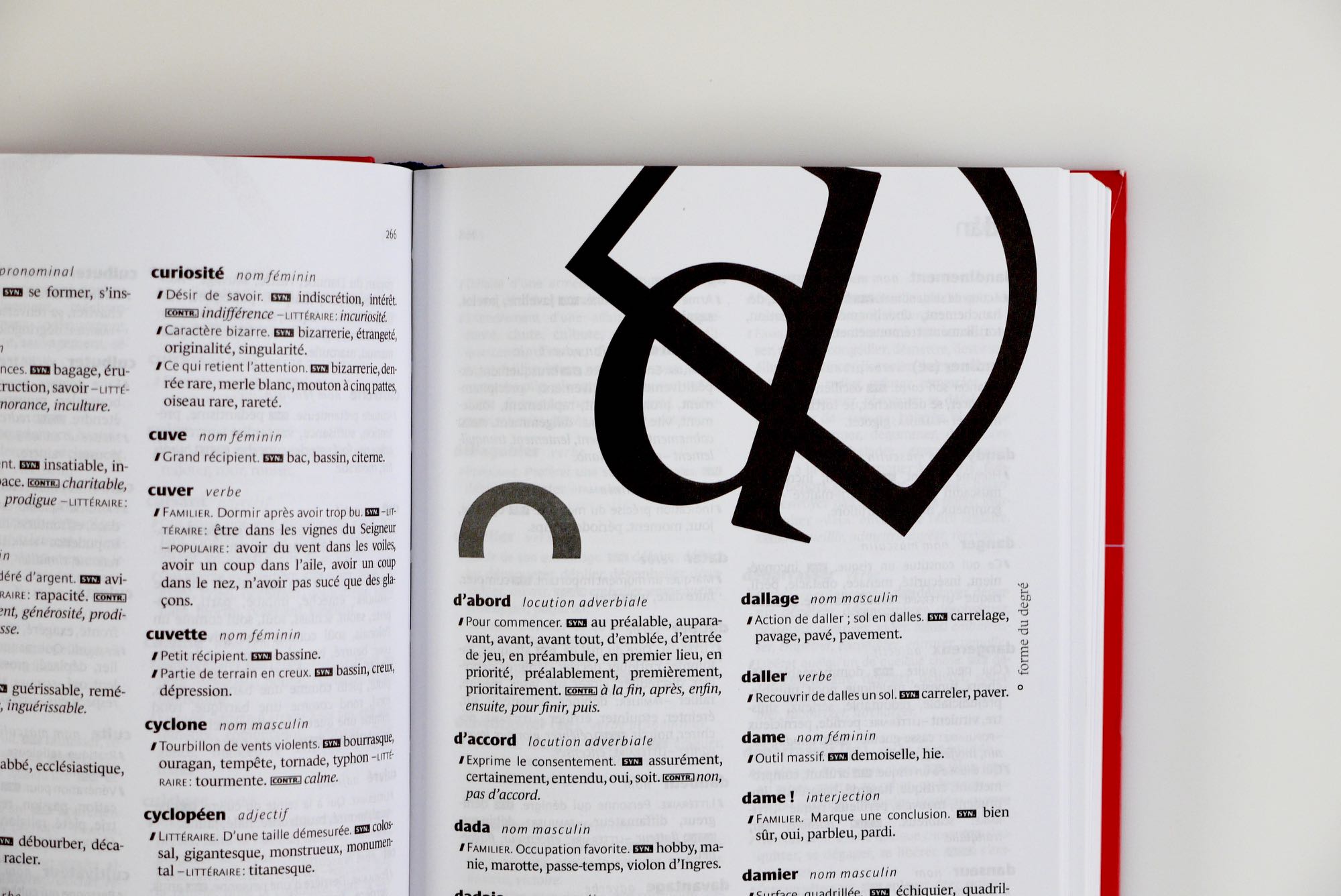 2
2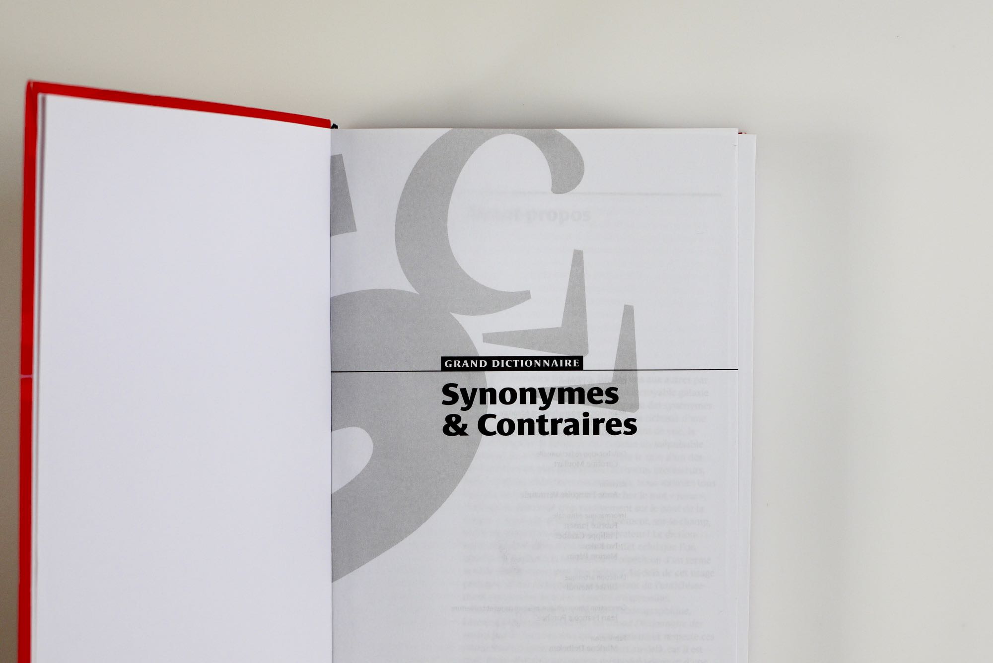 3
3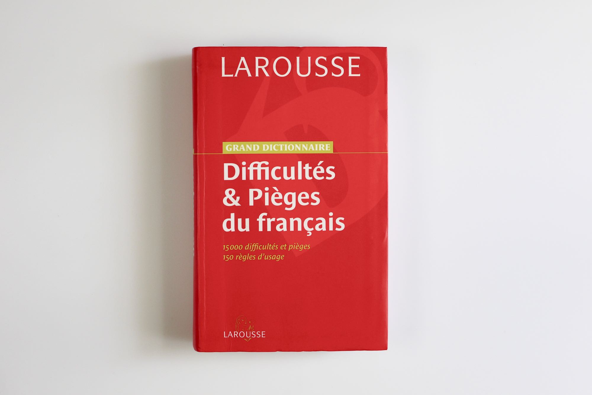 4
4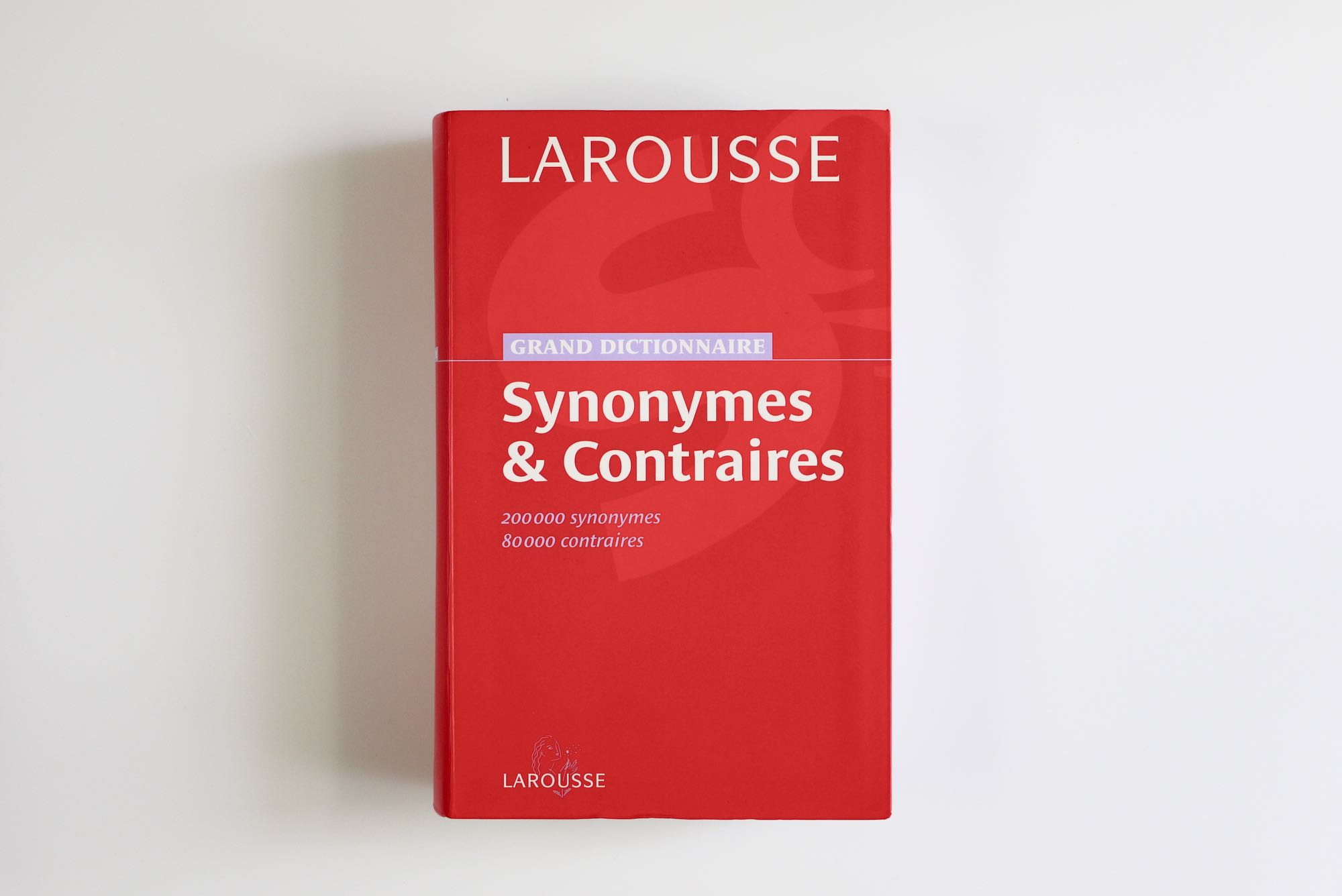 5
5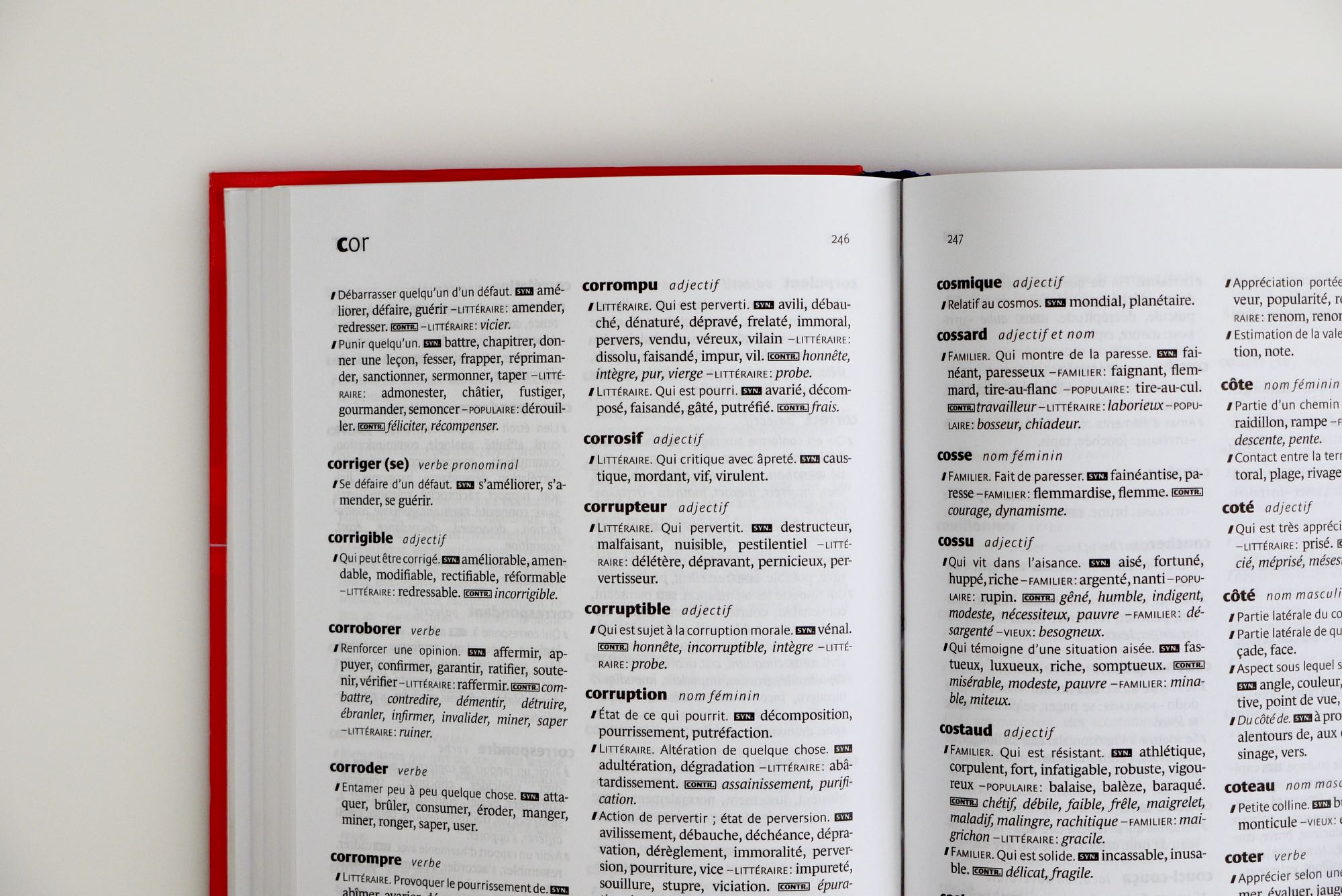 6
6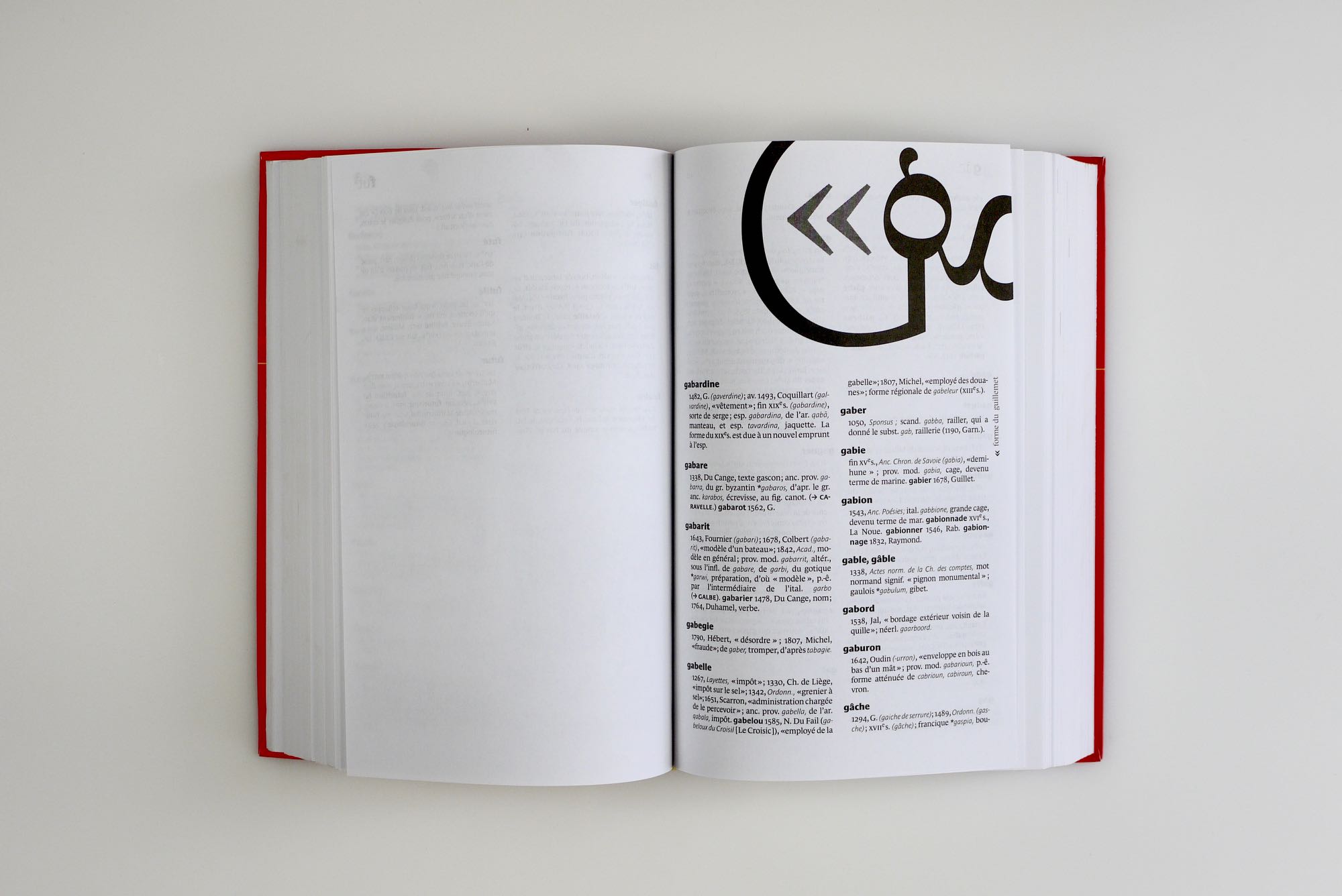 7
7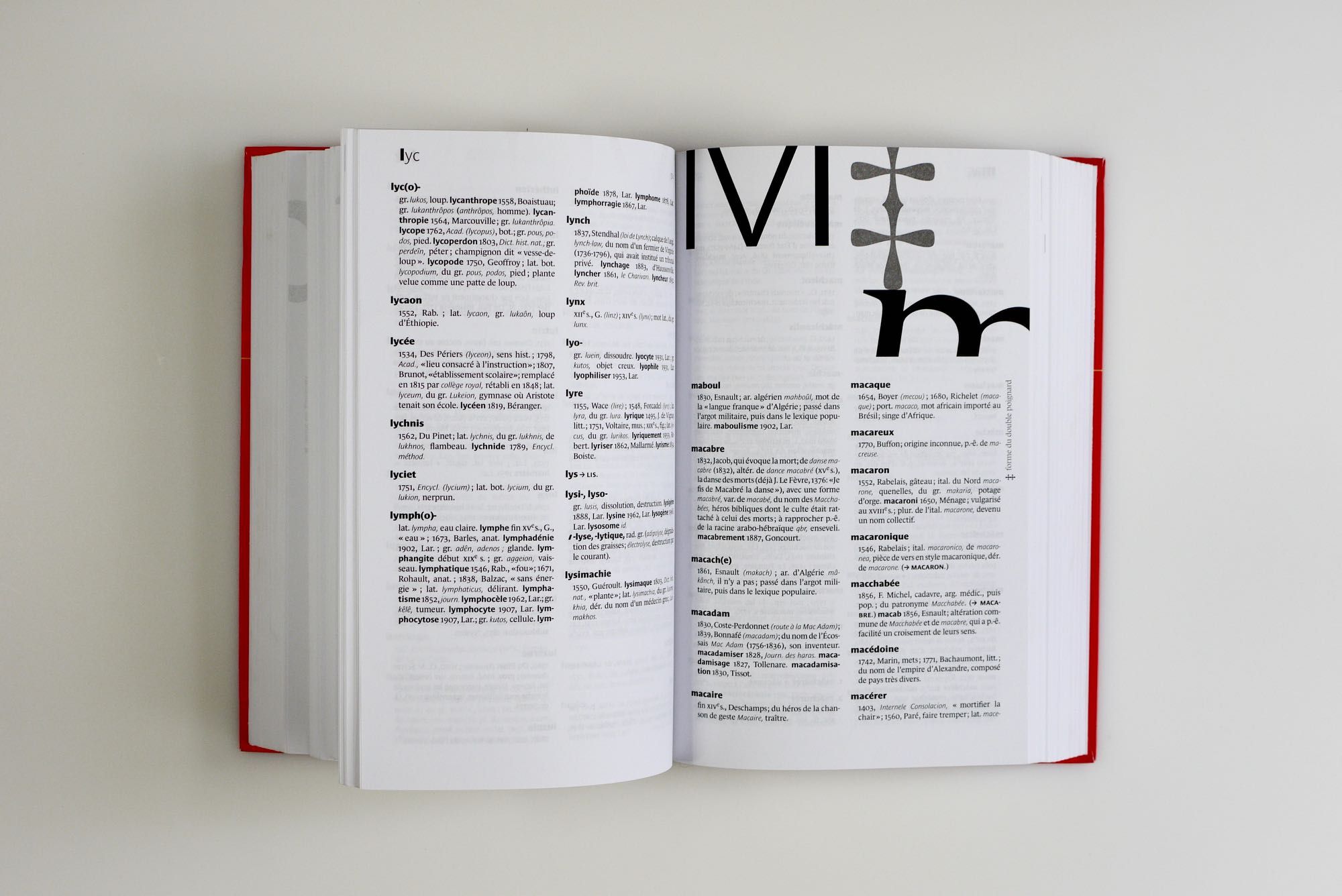 8
8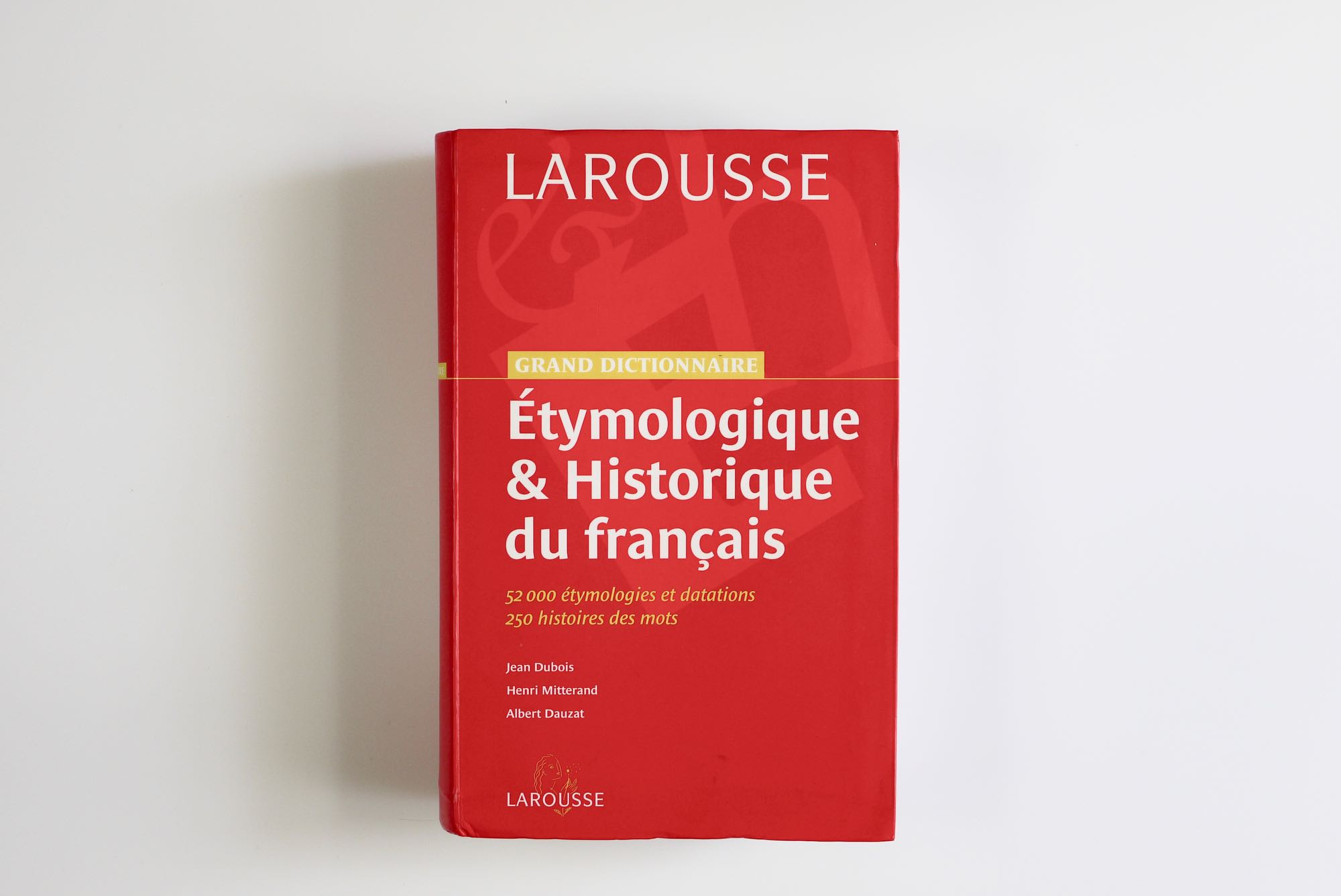 9
9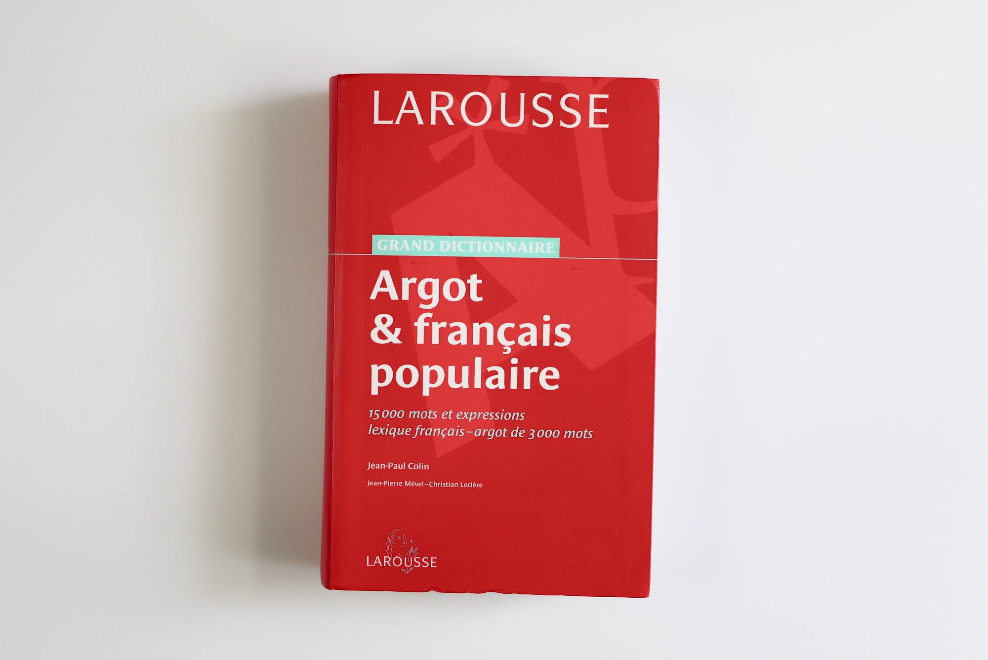 10
10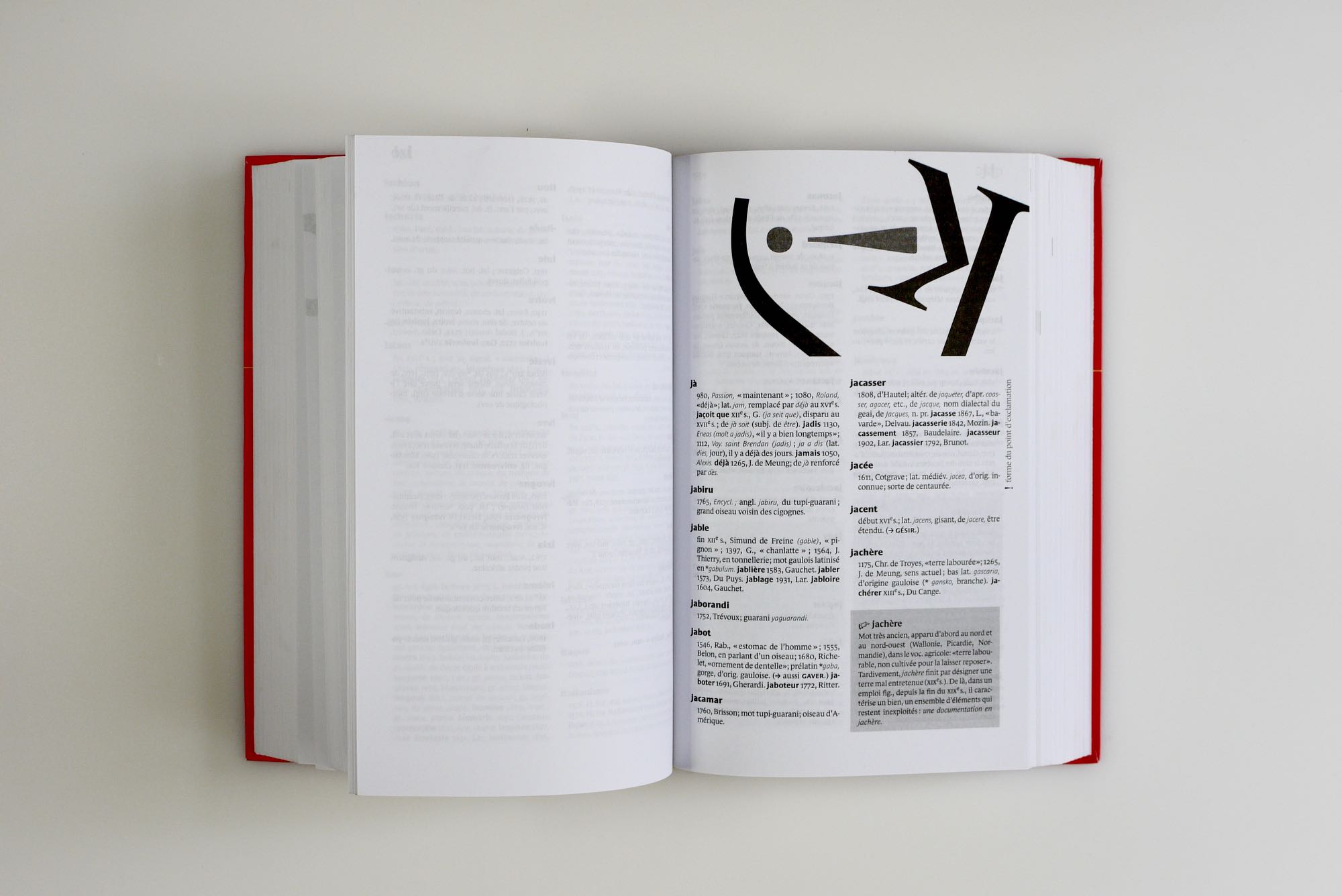 11
11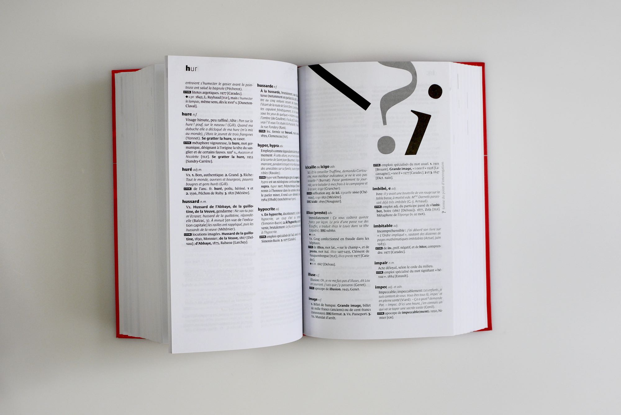 12
12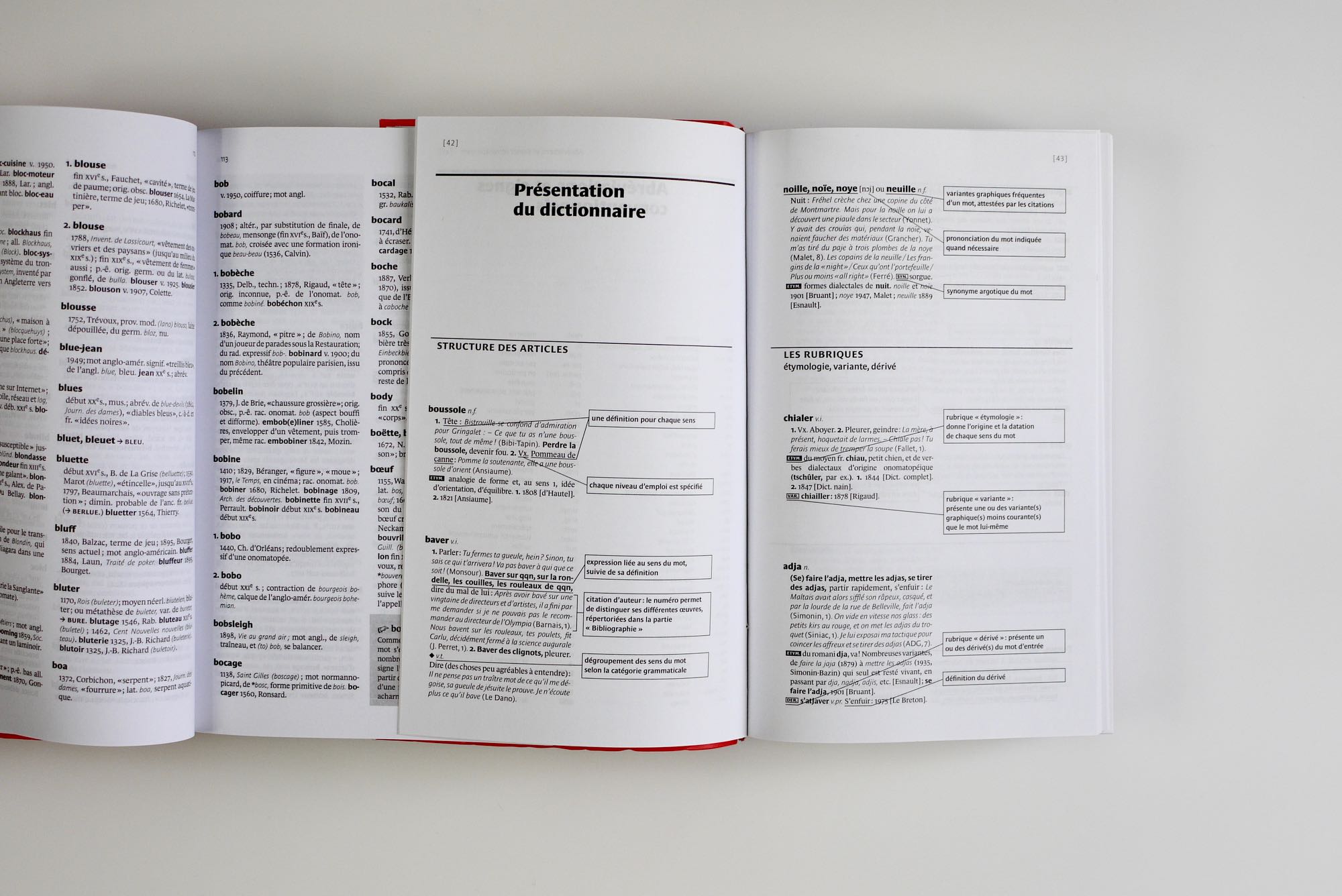 13
13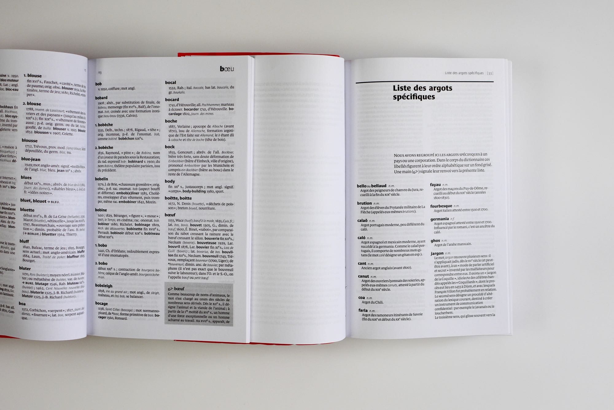 14
14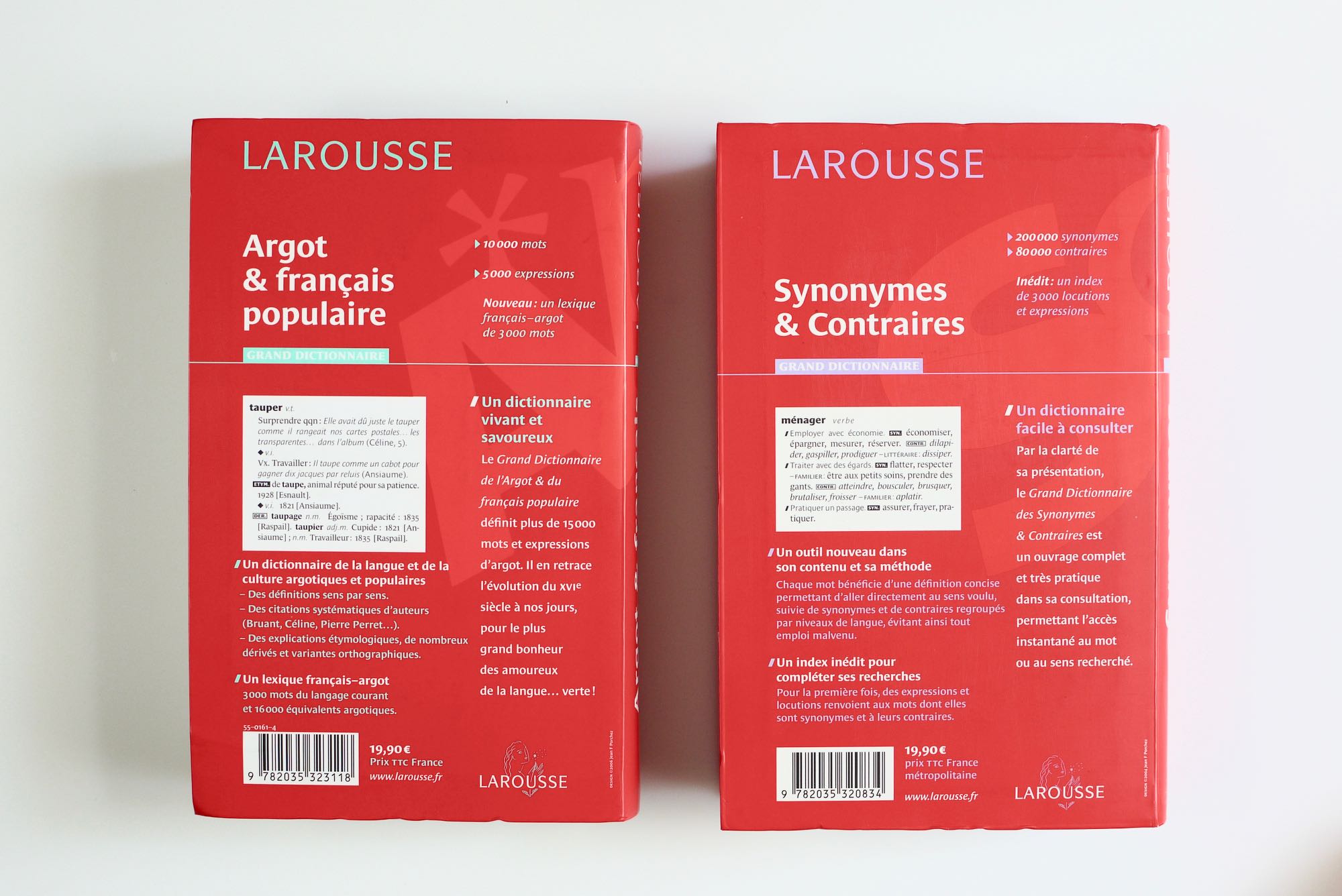 15
15A collection of ultra specialized dictionaries.
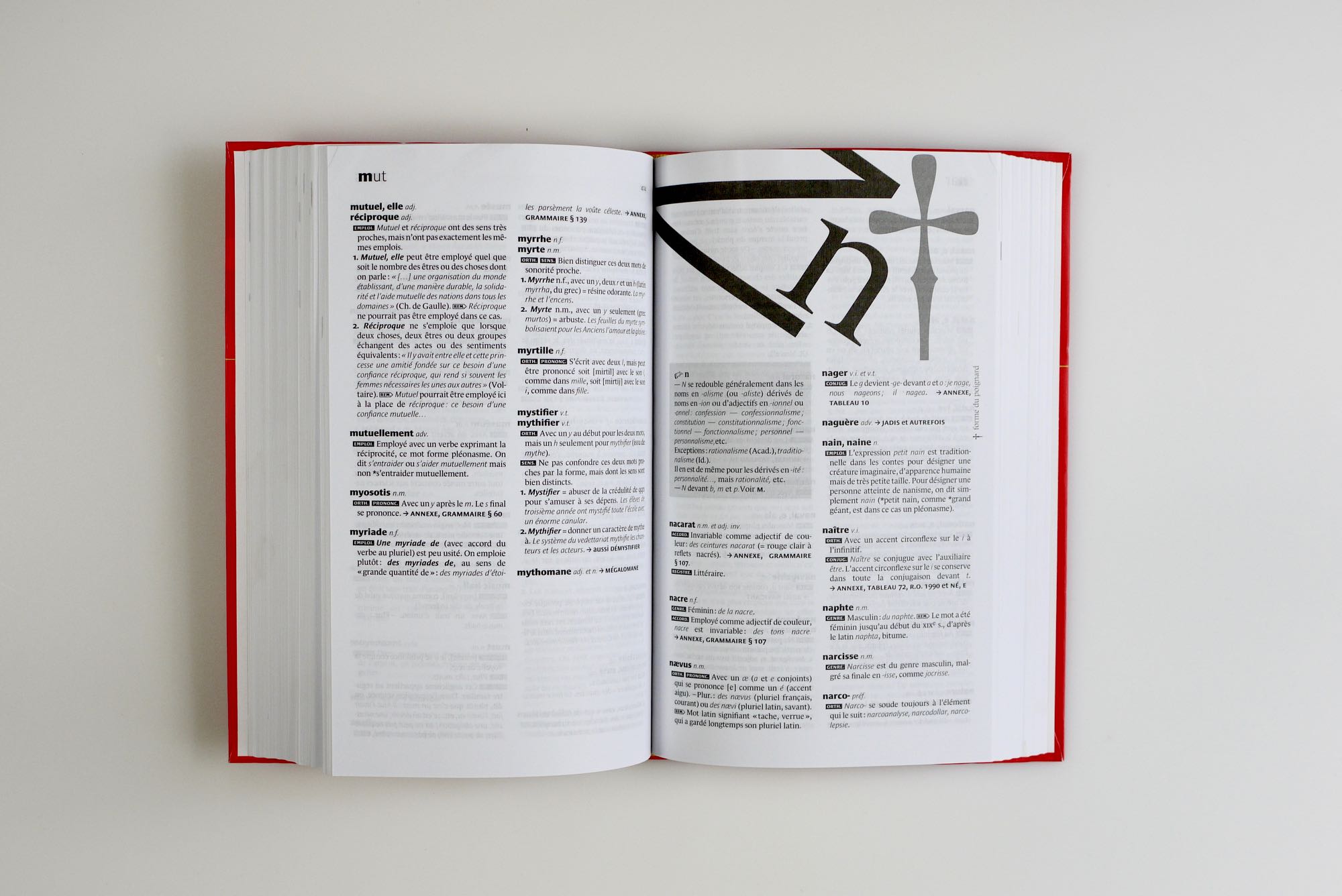
We worked on a revamp of Larousse dictionaries. The result is much more economical and legible than the past design. It’s a collection of highly specialized dictionaries. We worked for few months with the lexicography team at Larousse to understand the implication of any typographic decision. We’ve built specific typographic systems for each dictionary, to adapt to the unique content. At the end, the information is much more accessible for the reader, with clear typographic conventions.
Each new letter chapter feature the visual games for the lowercase and Capitals together with a punctuation mark. The punctuation mark functions is explained on the margins. The typeface used are Le Monde Journal and Le Monde Sans. In addition we’ve designed unique typefaces to cover specific functions as well marks, dingbats, etc. The final setting was done with XML files together with Indesign. We provide to Larousse publisher, typographic specifications to let them adapt the system to new contents. For the covers we built a simple system based on red color.