Diadermine


 1
1 2
2Diadermine
Logotype for Diadermine cosmetics (1994). Based on Angie Sans published by Typofonderie. Strangely this project never reached the phase 2, so the final version was simply the first showing, used as it is by the client. What is missing for a final version: Better balanced D, M + various optimisations of weights and proportions.
Client: Dragon Rouge.
1. Diadermine logotype in colors
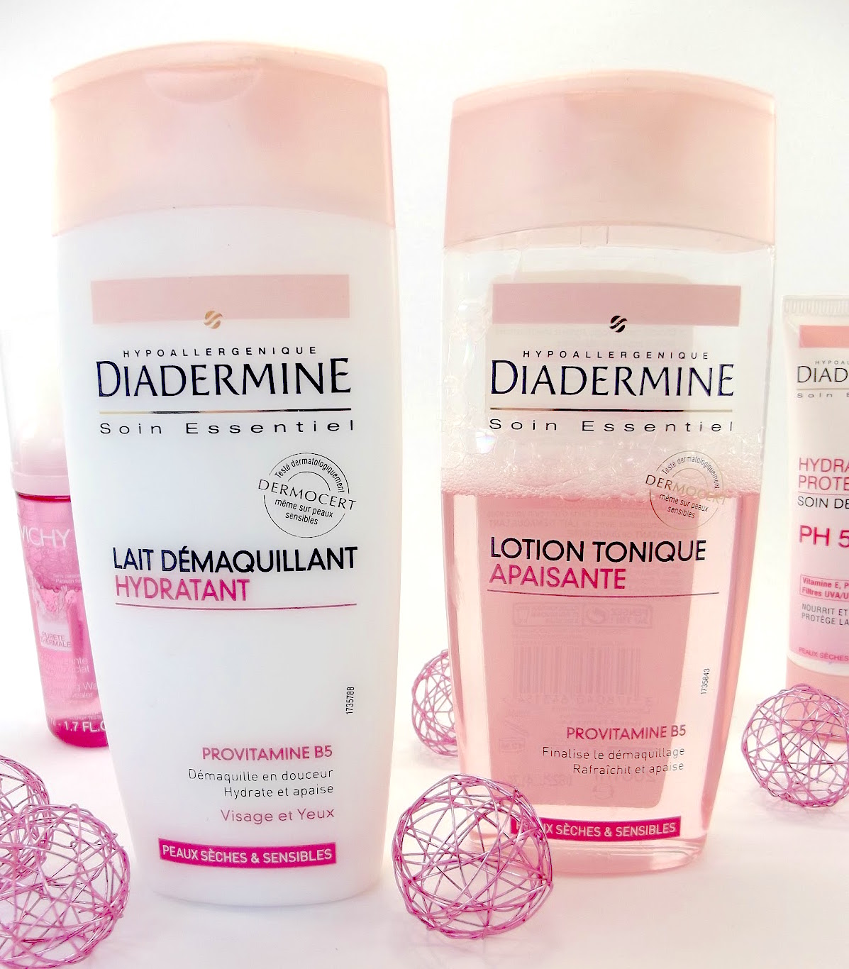
2. Diadermine logotype in use on packaging